Dashboard
See how your test plans are doing over time — runs per day by outcome, and a pass/fail history for every plan.
The project Dashboard is your at-a-glance view of how testing is going. It pulls together every run of every saved test plan so you can see, in one place, what's passing, what's failing, and which plans have started to regress.
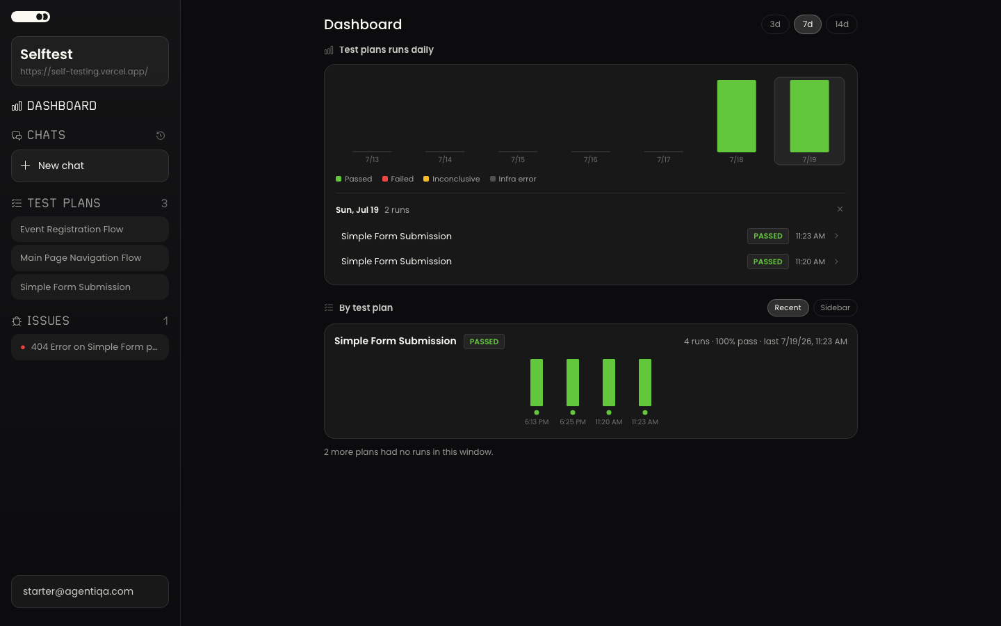
Runs over time
The top chart, Test plans runs daily, shows one stacked bar per day, colored by how each run finished:
- Passed — the run met its checks.
- Failed — a check failed.
- Inconclusive — the run finished but couldn't reach a clear verdict.
- Infra error — the run couldn't complete for an environmental reason, not a defect in your app.
Use the 3d / 7d / 14d buttons to change the time window. Click any day's bar to expand the runs behind it — each row shows the test plan, its outcome, and the time it ran, and links straight to that run's full results.
By test plan
Below the daily chart, each saved test plan that ran in the selected window gets its own row with a small history of its recent runs. For each plan you'll see its pass rate, when it last ran, and the outcome of its latest run.
Two badges call out plans that need attention:
- Regressed — a plan that was passing and has now started failing. The row lists the steps that newly failed.
- Flaky — a plan whose runs have been switching between pass and fail.
Sort the list by Recent (most recently run first) or Sidebar (to match the order of your test plans in the sidebar), and filter by name when you have a lot of plans. Click any run in a plan's history to open its results. Plans that exist but didn't run in the selected window are noted at the bottom of the list.
Before your first run
Until a saved test plan has actually run, the Dashboard has nothing to chart, so it shows a short getting-started prompt instead. Test plans are saved from your chats with the Assistant and then run — once the first one does, its results show up here automatically. See Test Plans and Runs.